Photos are more than just snapshots. To create images that truly stand out, you need to master high contrast and other basic photography techniques. Many beginners feel disappointed when their photos don’t match what they see with their eyes, and often the issue comes from inaccurate lighting and contrast. Understanding low contrast and high contrast is key to improving your shots.
What is Contrast in Photography?
In the early days, photography only captured light and dark elements. With limited colors and detail, contrast was simple. Today, thanks to digital technology, photographers can explore contrast in much greater depth. Instead of just shadows and highlights, you can now control color, tones, and textures to add dimension and creativity to your photos. Mastering exceptionally high contrast photography helps you produce stronger, more eye-catching images.
Essential Types of Contrast in Photography
There are several ways to apply contrast to your photos. The most commonly used are high-contrast and low-contrast. Still, others, such as tonal contrast and color contrast, are equally important. Let’s look at them one by one.
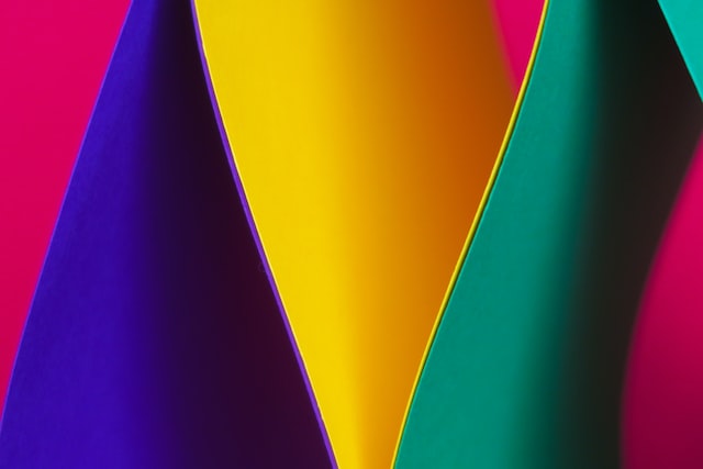
1. Color Contrast
If you are familiar with photography, you may notice that colors are distinguished into three: primary colors, secondary colors, and tertiary colors. They all exist on the well-known color wheel, appearing in contrast to the one on the opposite side of the color spectrum.
For example, blue sits across orange, and red exists on the opposite side of green. This contrast is usually called complementary colors. Instead of standing individually, the pairing will create quite an odd harmony. However, placing color contrast in a photograph is quite complicated.
However, you may get an astonishing result if you manage to tackle the challenge. If you are unsure of your ability, please don’t worry at all. There are numerous services available that would be willing to help you, including photo retouching services.
2. Low Contrast vs High Contrast
Low contrast gives photos a soft, subtle appearance, with many mid-tones instead of pure black or white. It’s perfect for calm, gentle images, for instance, a baby sleeping peacefully in a quiet room.
By contrast, high-contrast photography creates bold, dramatic images with a strong contrast between light and dark areas. A typical example is a sunset photo that highlights silhouettes. This technique is excellent when you want to emphasize the subject or make your photo feel intense and powerful.
High contrast doesn’t stop at brightness. You can also use vigorous color intensity and textures to add impact. The choice depends on your story and the creative goal you’re aiming for.
3. Tonal Contrast
Tonal contrast is the most commonly used type, especially when building an image. However, over time, cameras are getting more advanced. They are now able to capture details that were overlooked in the past. Despite this, it does not mean tonal contrast is neglected.
In its presence, images can reach a higher definition. For example, you have captured a full moon in a dark sky. Relying on autofocus on a camera may already benefit you with a great appearance. However, some details can be enhanced using tonal contrast.
You can use a massive range of colours despite just having two colours in one photo. One slight difference or shift is capable of changing various aspects of a photograph. If you succeed in editing, your photo may turn into a high-definition one.
4. High-Key and Low-Key
High-key and low-key do not involve high contrast, but the low-key one does. The terms are quite commonly found when you apply low contrast to a photograph. So, what is the difference between the two? The difference lies in the colour or tonal values.
For example, using high-key will benefit your photography by creating brighter tonal values that exist on the lighter end of the colour scale. The darker tones are quite unnecessary in creating contrast in it. On the other hand, the contrary applies to the low-key one. You will need to play with the black or darker tones instead of the brighter ones.
When to Use High Contrast for Stunning Photos
Use high contrast photography when you want bold, dramatic results. Portraits, sunsets, or street photography often benefit from this style because it emphasizes shapes, emotions, and atmosphere. Low contrast works better when you want calm, delicate, or storytelling images.
Ready to Enhance Your Photo?
Contrast is one of the crucial elements in photography. You can make your image less dull and more eye-catching to the viewers. However, using either low or high contrast depends on your goals. Suppose you are still confused about which option is the best. In that case, there is an image retouching service that will help you get a better result for your photography.
Image Source :