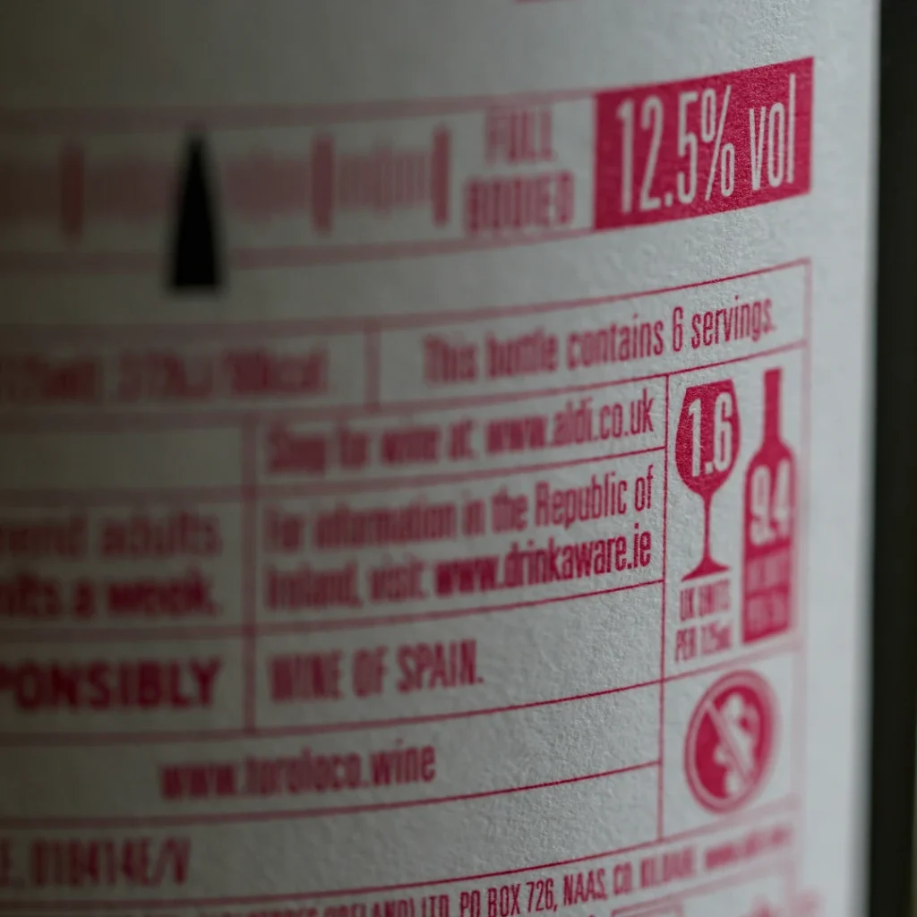
A supplement bottle, a skincare jar, a food package, all of these carry a label that isn’t just packaging design, it’s a legal document. For most product categories, a soft, glare washed, or poorly cropped label photo is a styling problem. For supplements, cosmetics, and food, it can be a compliance problem too, since regulators and marketplaces increasingly expect that label information to actually be readable in the listing photo, not just present on the physical product.
Why This Category Needs a Fundamentally Different Approach
Standard product photography optimizes for mood, composition, and visual appeal. Label legibility optimizes for something else entirely: whether a customer, and in some cases a regulator, can actually read every required word without strain. These goals aren’t always compatible. A dramatically angled hero shot might look great and simultaneously make an ingredient list completely unreadable, which defeats the purpose of that particular photo entirely.
What Regulators Actually Require, Not Just What Looks Good
For dietary supplements specifically, this isn’t just a best practice, it’s tied to actual legal requirements. The FDA’s own labeling guidance is direct about this: labels must use “easily legible boldface print or type that distinctly contrasts with the other printed or graphic material,” according to the FDA’s dietary supplement and food labeling guidance. While this requirement is written for the physical label itself, an increasing number of sellers and regulatory consultants treat the online listing photo as effectively part of the same transparency obligation, since a customer researching a supplement online is often relying entirely on the photo to read the Supplement Facts panel before purchase, particularly on marketplaces where the physical product isn’t in hand until after the sale.
What Actually Makes a Label Photo Legible
Straight on angle, not a dramatic perspective. Any meaningful angle distorts text, curving straight lines and compressing letters in ways that make reading genuinely harder, especially on a curved surface like a bottle or jar.
Even, glare free lighting. Glossy labels and shrink wrapped packaging are notorious for catching a hot spot of reflected light directly across the text. Diffused, even lighting, or a polarizing filter for particularly reflective surfaces, prevents this from obscuring critical information.
Sufficient resolution at the actual display size. A label photo that looks readable at full camera resolution can become illegible once compressed and resized down to a typical marketplace thumbnail. Testing legibility at the actual size the image will display, not just the original file, catches this before it becomes a problem.
Correct color contrast preserved through editing. Aggressive color correction or saturation adjustments elsewhere in an edit can inadvertently reduce the contrast between label text and its background if applied without care, undermining legibility in the process of making the rest of the photo look better.
A dedicated close up, not just a reliance on the main product shot. Even a well captured main image often can’t show every panel’s fine print at a readable size. A specific supporting image, cropped in on the label or ingredient panel, gives customers a genuine way to read the details without depending entirely on zoom features that vary in quality across platforms.
Why This Connects to Broader Trust, Not Just Compliance
A customer who can’t read a supplement’s dosage information or a skincare product’s ingredient list before buying is more likely to hesitate, ask a question that delays the sale, or simply move on to a competing listing where that information is genuinely accessible. This is a different flavor of the same trust dynamic covered throughout this content cluster: an inaccurate or illegible representation, whether it’s color, texture, or in this case actual required text, creates friction and doubt exactly where a purchase decision needs confidence instead.
A Practical Checklist for Compliance Sensitive Categories
Shoot the label straight on as a dedicated image, separate from styled hero shots that prioritize angle and composition.
Check for glare specifically on glossy or shrink wrapped surfaces, using diffused lighting or a polarizing filter as needed.
Verify legibility at actual display size, not just at full editing resolution, before publishing.
Preserve contrast during color correction, checking the edited label specifically rather than only reviewing the overall product’s visual appeal.
Include a dedicated, cropped in label or ingredient panel image as a supporting photo, rather than relying solely on the main product shot to communicate this information.
Frequently Asked Questions:
Are sellers legally required to make label text readable in listing photos?
The specific legibility requirements in regulations like FDA’s supplement labeling guidance are written for the physical label itself. However, many sellers and regulatory consultants treat the online listing photo as carrying the same practical obligation, since customers frequently rely on it to read required information before purchase.
What causes most label photos to become illegible?
Glare from glossy packaging, an angled rather than straight on shot, and insufficient resolution at the actual display size are the most common causes, along with aggressive color editing that inadvertently reduces contrast between text and background.
Do I need a separate photo just for the label?
For compliance sensitive categories like supplements, food, and cosmetics, yes, generally. A dedicated, straight on, cropped in image of the label or ingredient panel ensures the information is genuinely readable, rather than depending on customers zooming into a styled main product shot.
How can I check if my label photo is actually legible before publishing?
Reviewing the image at the actual size it will display on a listing or marketplace page, rather than only at full editing resolution, is the most reliable way to catch legibility problems that wouldn’t be visible while zoomed in during editing.