
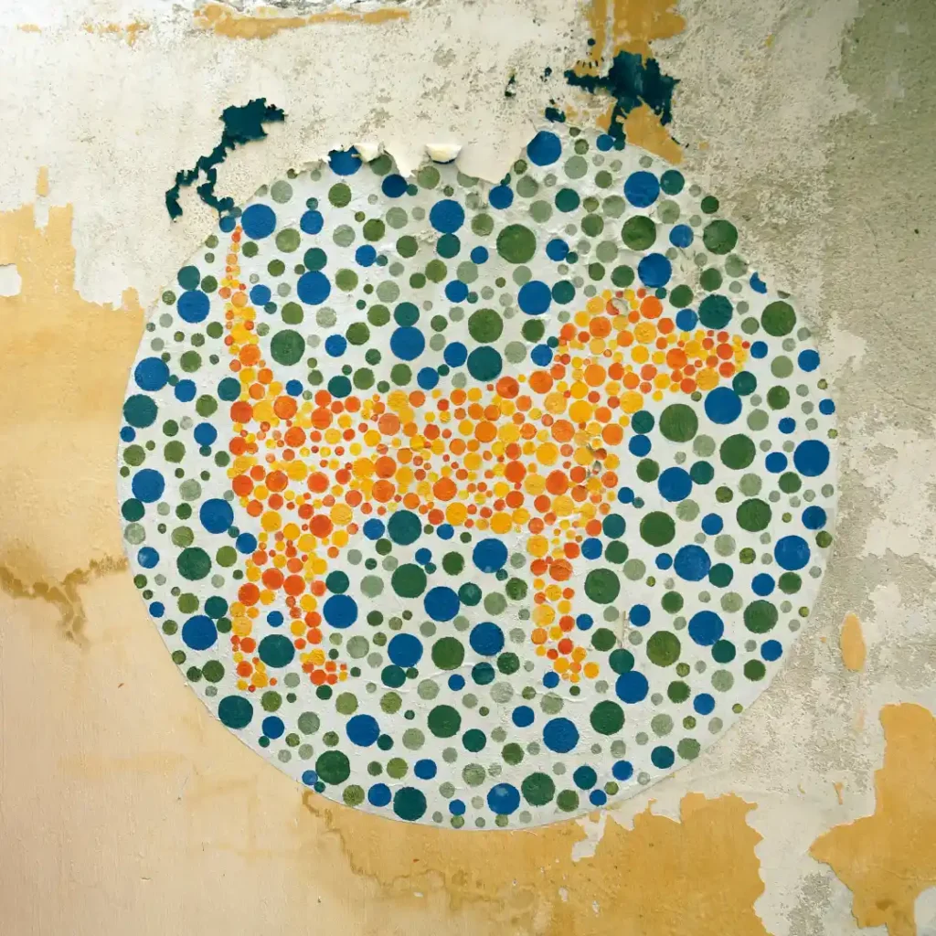
A striking share of your customers may see your product photos differently than you do, and most sellers never think about it. Color blind affects a meaningful portion of the population, most commonly men. It changes how certain color combinations in a photo, and on a page, actually get perceived.
This isn’t a niche accessibility footnote. If part of your product’s appeal is described in color (a red versus green variant, a “matches perfectly” claim, a color coded size chart), a color blind shopper may be working with less information than you assume.
What Color Blind Actually Changes
Most color blindness isn’t seeing the world in black and white, which is a common misconception. The most frequent forms affect the ability to distinguish red from green, or occasionally blue from yellow, because of how certain color receptors in the eye respond differently than typical vision.
For product photography, this matters most in a few specific situations:
- Product variants distinguished mainly by red versus green tones
- Color swatches or size charts that rely on color alone to convey information
- “Sold out” or “low stock” indicators shown only through a red versus green color change
- Product photos where subtle color differences are the entire point, like paint swatches or fabric samples
Why This Is an Ecommerce Problem, Not Just a Design Problem
A shopper who can’t reliably distinguish your red variant from your green variant in a photo is more likely to order the wrong one. More likely to feel frustrated with the buying experience, and more likely to return the item once it arrives. None of that shows up cleanly in your analytics as a “color blindness issue.” It just shows up as confusion, hesitation, or returns with no obvious explanation.
This connects directly to the same color accuracy work discussed in our guides on sRGB and colorways, but from a different angle. Those pieces are about making sure a color is captured and displayed correctly. This is about making sure the difference between colors is actually perceivable by everyone looking at it, not just by someone with typical color vision.
Practical Steps to Make Product Photos More Accessible
Never rely on color alone to convey critical information. If a size chart or availability indicator uses color, always pair it with a label, icon, or text, not color by itself.
Increase contrast between color variants where possible. If two colorways are visually close for someone with red green color blindness, consider photographing them with a visible label or distinct background element that makes the difference clear regardless of color perception.
Check your listings using a color blindness simulator. Free browser extensions and tools can show you approximately how a page or image appears under different types of color blindness, which is a fast way to catch problems before a customer does.
Write accurate, specific color names in your product titles and descriptions. A shopper who has trouble distinguishing “forest green” from “maroon” visually can still make an informed choice if the text description is accurate and specific, rather than relying on the photo alone.
Frequently Asked Questions:
1. How common is color blindness?
Red green color blindness is commonly cited as affecting roughly 8 percent of men and less than 1 percent of women, primarily in populations of Northern European descent. Other populations show different rates, and blue yellow color blindness is much rarer.
2. Does color blindness mean someone sees in black and white?
No, that describes total color blindness, which is extremely rare. Most color blindness involves difficulty distinguishing specific color pairs, most often red and green, rather than an inability to see color at all.
3. How can I check if my product photos are accessible to color blind shoppers?
Free color blindness simulator tools and browser extensions can show approximately how an image or webpage appears under common types of color blindness. Which is a practical way to catch potential issues before publishing.
4. Should I avoid using red and green together in product photos?
Not necessarily, since that’s often unavoidable when it’s the product’s actual color. The more important fix is making sure any critical information, like which variant is which, doesn’t depend on color alone to be understood.